In Part One, we walked through our initial steps — including everything we do and need before the true logo design can begin. In Part Two, we dive into the steps beyond the prep; the creative process!
Every great logo design usually starts with a sketch. Be it a doodle on a napkin, or a carefully crafted pen crafted illustration —almost every project starts with paper.
Mood Boards and Reference Imagery
Mood boards and reference imagery are collected from the start, occasionally we ask that the client send over images that portray the look and feel they want to communicate through logo design.
Quick Sketches and Basic Forms
From the very first sketch, there could be visual iconography or shapes that are appealing and worthy of further development. At this stage, we may want to move to grid paper or dotted paper, re-drawing, enlarging and refining with a pen for the next steps.
Refining the Logo with Gridlines
Further development of the sketches may take the form of grids and lines to refine, balance, and align elements correctly. Even organic shapes can be improved by using a constructed grid — be it just how the logomark potentially sits alongside the logotype.
Conceptualization
Although conceptualization can typically be defined as ‘the forming of a concept,’ at this point of the logo design process, it’s more of a case of refining an idea further and putting it onto the computer. The ‘idea’ is given a new viewpoint on a screen, which allows us to observe any immediate concerns that may have been overlooked in the sketch.
Working either with a scanner or recreating it in Adobe Illustrator, the primary forms are digitally constructed. Digital versions allow for quick amendments, adjustments, and the ability to fine-tune the design.
Exploration in Monotone
Before any color is applied to the design, we first assess the design in monotone. We see a lot of poorly created logo designs where the designer did not consider how the logo would look in black and white. Even though ‘fax’ as a medium may be dying out, a great logo design must have the ability to look good in any format, in any output.
Creating a Logotype
Once we have some rough ideas to work with for the logomark, we start to think about how the company name will be represented through the logotype. We start with a general idea of the style of typeface we are looking for, such as a contemporary sans-serif or old style serif, but finding the perfect font for the job requires time spent browsing through an extensive font library.
On the off chance we can’t find anything that fits the bill, a stylistically ‘close’ font may be customized to fit the needs of the project. This can be advantageous, as it further creates a unique quality to a brand. However, a bespoke font can add costs.
Bringing it all Together
Once we have a handful of typefaces that are appropriate to the brand, we explore how they look side-by-side with the logomark symbols created previously. In tandem, several chosen color palettes are integrated into the design to see what feels like the best approach.
Refinement & Initial Client Presentation
At this step, the strongest logo concepts are collated into a document to present to the client. AEDC shows how the logo looks on various background colors, at different scales, and alongside some logo mockups — such as rendering the design on a uniform or vehicle wraps. This helps the client visualize the logo in the ‘real world,’ rather than just on paper. Showing how a concept would look on a shirt, for example, can help them see the idea over the visual aesthetic. Plus, it always tends to impresses — so we try to spend time ensuring that appropriate mockups are included.
The initial logo design presentation is exported to a secure PDF format, allowing the client to view on screen or print out. Printing is always recommended as monitors may not show colors accurately, and the embedded print profiles allow for an accurate representation. Each concept should have its own PDF, ranging from 5–10+ pages depending on the scope of the project.
Feedback and Consultation
We advise clients to spend a few days to a week with the initial concepts, although first impressions are worth noting. Print them out and stick them on the wall around the house or office. Let the eye be drawn to them randomly, and naturally, as any real-life viewer may do when encountering a brand. Ask for feedback from friends and family, including any employees who understand the brand.
All opinions are valid and provide a direction that allows us to improve upon the design. We may have more questions to further extract detailed feedback from the client.
Discuss Logo Concepts with Client
When we present our initial concepts to clients, we share our intention behind each concept we feel strongly towards. This discussion could take no time at all if the client has found one of the concepts to be perfect as is, or several hours if they have uncertainties or questions that need clarifying.
Development varies considerably between projects, but overall, it is typically easier to develop the aesthetic side as opposed to the conceptual. Aspects such as alternate color schemes or typeface can change the ‘look,’ but the significance or meaning behind a logo is much harder to modify.
Based on the discussion and feedback from the client, we then develop and tweak the chosen concept. This could include minor changes to the color scheme, looking at different layouts, or presenting a few alternative typefaces for the client’s consideration.
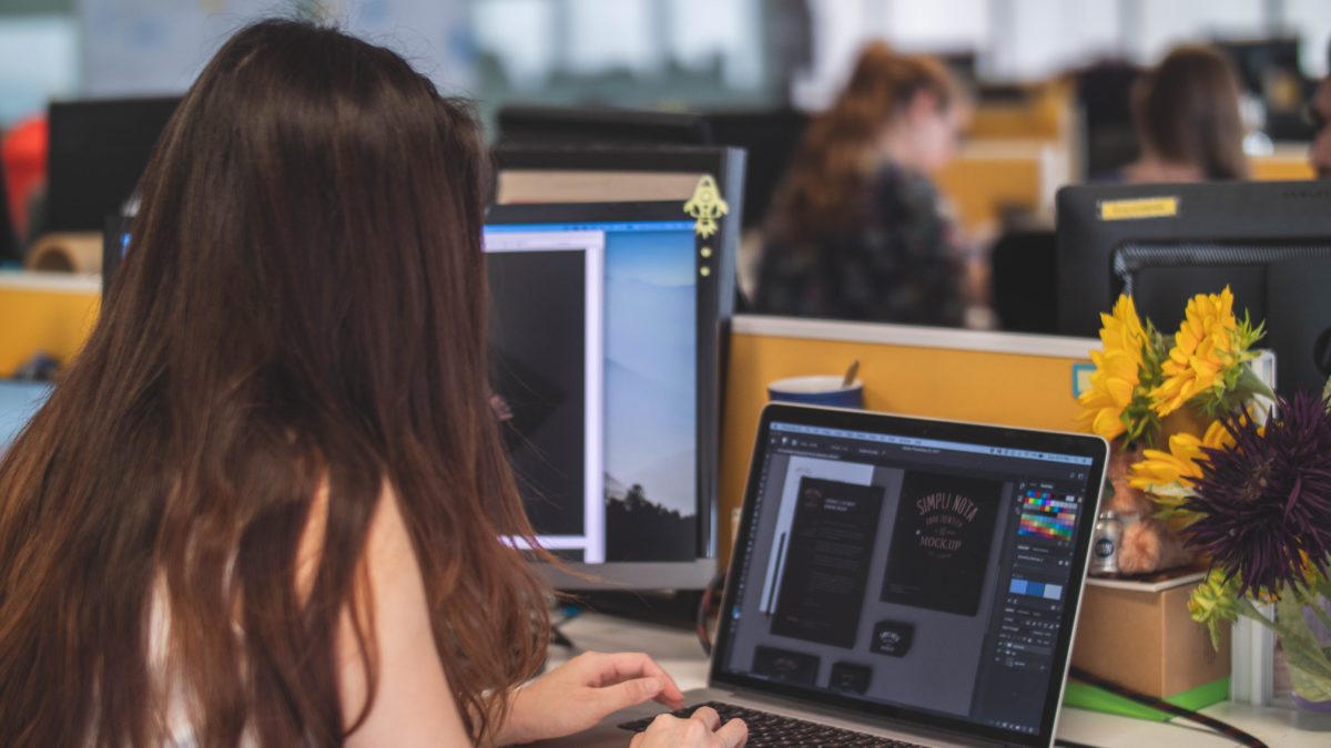
Completed Graphic Design Presentation
This step is similar to the initial concept presentation, however, this stage involves a more focused approach, where one concept has been fully flushed out. Further mockups and realized stationary or business cards are presented. Once the final logo has been signed off on, we move into the branding process!
To learn more about the branding process and our final delivery of your Brand Identity, stay tuned for Part 3!