If you saw a McDonald’s with arches that were anything but golden, would you eat there? Or would you be a little suspicious? Consistency is one of the most important aspects of building a recognizable brand. That’s because consistency establishes professionalism and fosters trust. And when it comes to creating a consistent, trustworthy brand, it’s critical to have a canonical brand style guide that anyone on your team can refer to in executing your marketing strategy.
At Alter Endeavors, a key part of our process in developing a marketing strategy is to establish concrete guidelines for using the various aspects that make up the brand. From logos to colors to typography, each element needs to be as consistent as possible across every marketing channel.
Each of these guidelines is compiled into a brand style guide—or as we refer to it, a brand usage guide. But what exactly is a brand style guide, and why does it matter for your business? We’re taking a look in today’s post!
What is a brand style guide?
A brand style guide is a set of instructions for how to use all of the elements that make up your brand, including logos, colors, typography, and more. It specifies how your brand should be communicated and establishes a canonical rulebook that you—or anyone who works for or with your brand—can refer to at all times.
As you go about executing on your brand strategy, a brand style guide ensures that all of your marketing materials are consistent, no matter where they appear.
This is why we refer to the brand style guide as a “brand usage guide.” It breaks down the different aspects of your brand we’ve created and tells you how to, well, use them—and use them correctly.
What goes into a brand style guide?
The specific contents of a brand usage guide will vary from client to client. In general, though, there are five key components that are included in just about every usage guide we create. Let’s briefly cover each of these.
1. Outline of all logo versions and visual assets
A brand style guide includes all visual assets that your brand will use. This includes logos first and foremost, of course. Most brands will have at least two versions of their logo, some more, and the usage guide will outline what each version looks like.
For example, our client Trinsic Technologies used both a full logo and a version with just their icon.

In addition to logos, visual assets include things like additional icons, background textures, or patterns the brand uses, as well as where these are to be used.
2. Guidance on when to use each logo version
Generally speaking, most brands don’t have just a single logo that’s used in every situation. Having multiple versions of your logo gives you greater flexibility in how your brand is displayed and in which contexts.
A brand usage guide will break down which versions of your logo are to be used in what situations.
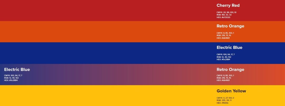
3. Color and typography usage
While logos are perhaps the most recognizable aspect of your brand, you’d be surprised at what a difference using the wrong shade of a color or a slightly different font can make to the look and feel of a brand.
A complete brand style guide will describe, in detail, what colors are to be used for your brand, as well as describe the typography your brand uses.
Here, you can see that Trinsic’s brand included a wide range of colors, each of which was carefully and specifically detailed in their usage guide.

4. Logo spacing and layout guidelines
This portion of the usage guide describes the specific makeup of your logo, as well as how it’s laid out.
What size is the logo in relation to the wordmark of your brand? How are the elements spaced within the logo? What’s the minimum size for your logo? Each of these pieces of information will help keep your branding as consistent as possible.
5. Common errors and “do-nots”
No set of instructions is complete without warnings about common pitfalls and errors. A full brand style guide will include examples of common errors when it comes to executing your brand. This can include things like stretching, cropping, or altering your logo, adding features (such as drop shadows) to text or visual assets, and more.

Why do I need a brand style guide?
Building a brand is a lot like cooking a meal or baking a cake. There are a lot of steps, a lot of different component parts, and a lot of things that could go wrong along the way. If you ask us to help you make a cake, and we simply hand you the ingredients without giving you any further direction, we aren’t helping you very much.
Similarly, just creating the various elements of your brand identity doesn’t equate to creating a brand. Much like a recipe, a brand style guide gives you all the direction you need to take your brand and execute on it again and again.
In many ways, a brand usage guide is a preventative document. Inconsistent branding or poor usage of elements like logos, colors, and typography can make your brand and business seem unprofessional, which damages trust.
A complete brand usage guide helps your business successfully execute on your brand and maintain consistency, whether you continue working with us, hire another agency, or carry out your own marketing efforts.
Alter Endeavors Gives You the Recipe for Brand Success!
Working with a client is much more than a number or sale to our team here at Alter Endeavors. When we create a brand, our goal isn’t to just come up with ingredients and hand them off—it’s to give you all the ingredients, methods, instructions, and demonstrations you need to succeed with your brand, again and again.
If your business is struggling to maintain consistency with branding, or if you’re just starting out with the entire branding process, Alter Endeavors can help! Contact us today to get started.